PDF Layout Studio
User guide
The layout studio is intended for the creation of PDF style sheets and their management by the user in complete autonomy.
1. Create a style sheet
By default, all style sheets are stored in the language.
![[Note]](cco-note.svg) | |
It is possible to create a style sheet in a particular language, in order to perform specific settings that respect the constraints of this language. |
In your workspace, in the menu, click .
A new Calenco PDF Studio tab opens for style sheet settings.
2. Action bar
Like all Calenco content, style sheets have two names (see more information on Naming contents):
- The technical name is created by default.
The label is personalized and can be changed at any time.
![[Important]](cco-important.svg)
The style sheet is created in Calenco when it is first saved.
The updated label is visible in the definition of existing publications using the stylesheet.
Click on  the right of the action bar, to download the style sheet directly from the studio.
3. Setting up a style sheet
All the elements of a document that can be configured with the studio are organized into three main menus.
A parameter editor is associated with each sub-menu.
The preview area instantly displays the changes made.
Preview tools allow you to:
- zoom in / out the preview area
- show/hide page body area and header and footer.
3.1. General
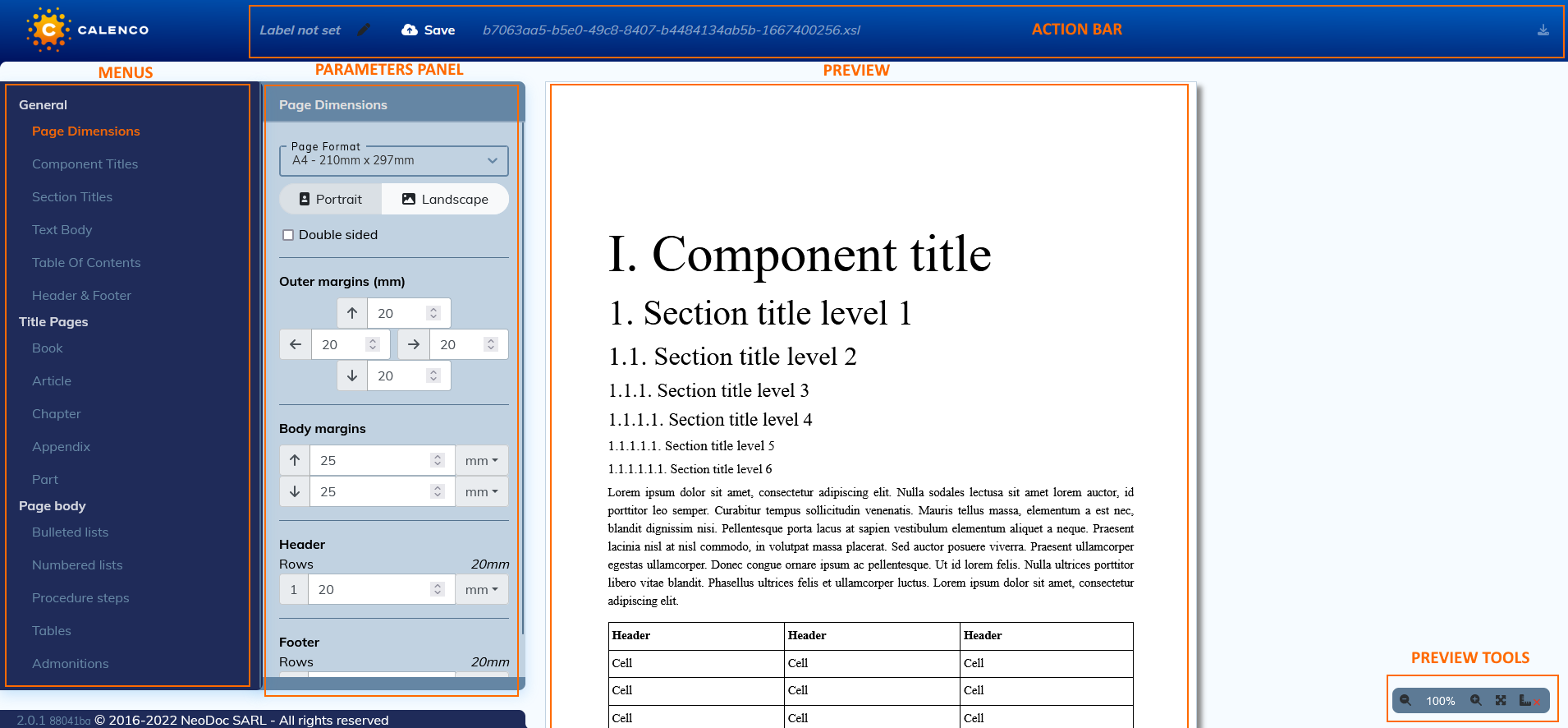
3.1.1. Page dimensions
This menu contains settings that apply to all pages of a document.
The default measurement unit is “millimeters”.
There are two other units of measure to choose from for some parameters:
- pt: relevant unit for documents to be printed;
- em: unit relative to the font size. It is relevant for documents that will be viewed on screens of different sizes (laptops, external screens, tablets, smartphones).
Header and footer
Use these settings to adjust the row height with the full page preview.
Make the initial header and footer setup with the menu Header and footer.
3.1.2. Structure element titles
The settings made in the menu affect all structural elements present in the document.
The menu of each element allows you to set specific values for some styles while preserving the default values for others.
By setting the particular values, the arrow to the right of each parameter becomes active.
Click the arrow to return to the default.
The Hyphenate feature allows you to hyphenate a particularly long word at the end of a title line.
3.1.3. Section titles
This menu is dedicated to setting the titles of 6 section levels.
The Hyphenate feature allows you to hyphenate a particularly long word at the end of a title line.
3.1.4. Text body
This menu is dedicated to setting the text of the document excluding the titles.
The Show links reference feature allows you to display the url address of a link embedded in the text via → → .
3.1.5. Table of contents
This menu is dedicated to setting the table of contents:
- specific to the whole document;
- specific to each structure element that is part of a document;
- for figures and tables (for documents in “book” structure).
Click on  next to the item for which you want to display the table of contents preview.
Click on  next to the items you want to enable/disable the table of contents for in your publication.
The “Maximum Level” parameter defines the granularity of the table of contents.
The “Section Levels” setting defines the granularity of the table of contents specific to document sections.
| |
The result of this setting is visible directly in the publication. |
Use the menu (to the right of the preview area) to hide elements that are missing from the structure of your document in the preview.
The menu allows you to format each type of element defined for the table of contents.
3.1.6. Header and footer
This menu is dedicated to the configuration of headers and footers for all the pages of the document, including the title page.
Editing modes
There are three editing modes:
 edits the header and footer without preview;
 edits the page header with preview;
 edits the footer with the preview.
 This tab allows you to preview headers and footers along with the page content.
Composition of header and footer
Setting up the header and footer areas includes:
- add/remove rows and columns;
- modification of the height / width of rows and columns;
- vertical and horizontal alignment of all widgets in the line.
The composition of the header or footer is done by dragging and dropping a widget into the desired area on the green background that appears when the widget hovers over the top edge of the area:
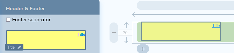
A zone can host several widgets.
Editing a widget placed in the area follows the procedure described in Widgets.
3.1.6.1. Widgets
The settings panel contains widgets that can be used in the header and/or the footer.
Editing each widget can be done directly on the settings panel. In this case, the widget can be reused as a template with predefined formatting. This type of editing is recommended for Text and Image widgets where the content can be modified for each reuse.
The standard widgets that bear the name of the elements of the XML document (Title, Date, Author, etc.), are reserved for these elements only. The custom Xpath widget allows you to retrieve other elements from the XML document to link them to the style sheet.
The configuration of the personalized Xpath widget follows the procedure described in Custom Xpath Widget Setup.
Click on
 to the right of the widget name.
A window opens with the settings.
Click on one of the colored parts of the margins and borders diagram to display its characteristics:
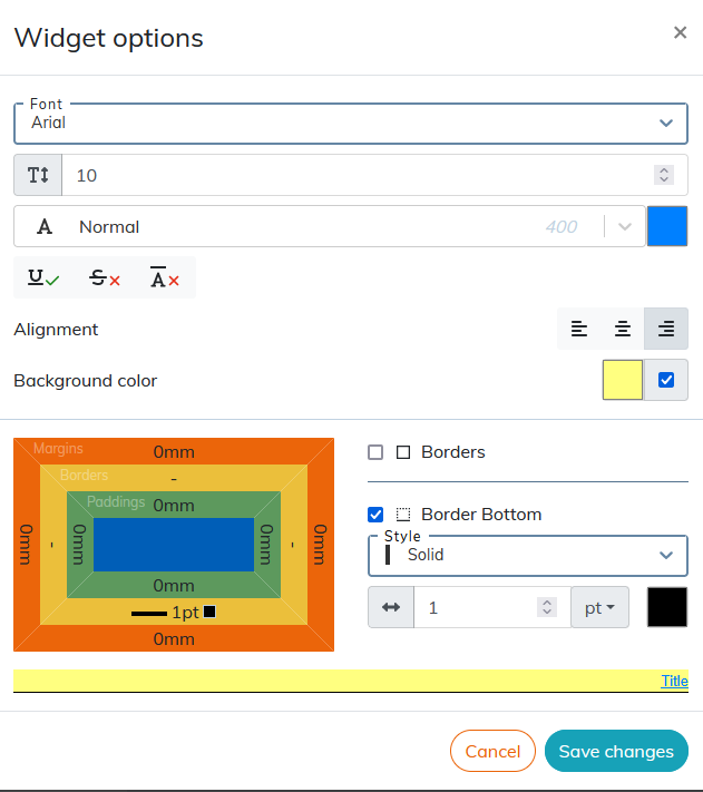
The result of the setting is displayed in the preview area at the bottom of the window.
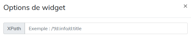
Custom Xpath Widget Setup
The custom Xpath widget allows you to retrieve elements from the XML document that are not available in the standard widgets.
Custom Xpath widget is used in headers and footers and cover pages.
XPath is a language for identifying the elements of an XML structure. The configuration of the widget consists in composing an access path for the element of the XML document. This path is made up of nodes (elements, attributes, processing instructions, etc.) linked together by path expressions.
| |
The use of path expression types is described in Table 1, “Most Common Path Expressions”. |
The Information block contains information that is not published by default. The custom XPath widget allows them to be published.
Elements that can be retrieved from the style sheet via xpath, must also be placed in the Information block of the XML document:
Procedure 26. To compose the xpath:
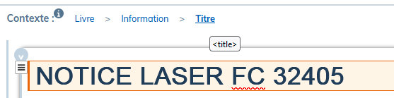
In the
Informationblock, select the desired element.In the Context, locate the name of this element.
These names are part of the naming convention according to the DocBook standard and are displayed in the tooltip when hovering over each element.
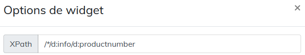
In the studio, drag the widget into the preview area. Click on
to the right of the widget name.In the XPath field of the studio, place the nodes represented by the names of the elements. Precede each name with
d:and separate with/. Since the elements are placed in theInformationblock, the path will start withd:info/.For xpath elements in the header or footer, the path must start with
/*/.This allows the style sheet to retrieve the element for all sequences of pages generated by the structural elements (chapters, sections, preface, etc.) present in the document.
| |
The value-of or apply-templates feature. When publishing, some items may be published in red: |
Setting the xpath to select particular elements of the same type
It is possible to retrieve several elements of the same type (several images, several tables, etc.) in the style sheet via xpath.
Here is the example of the image recovery procedure.
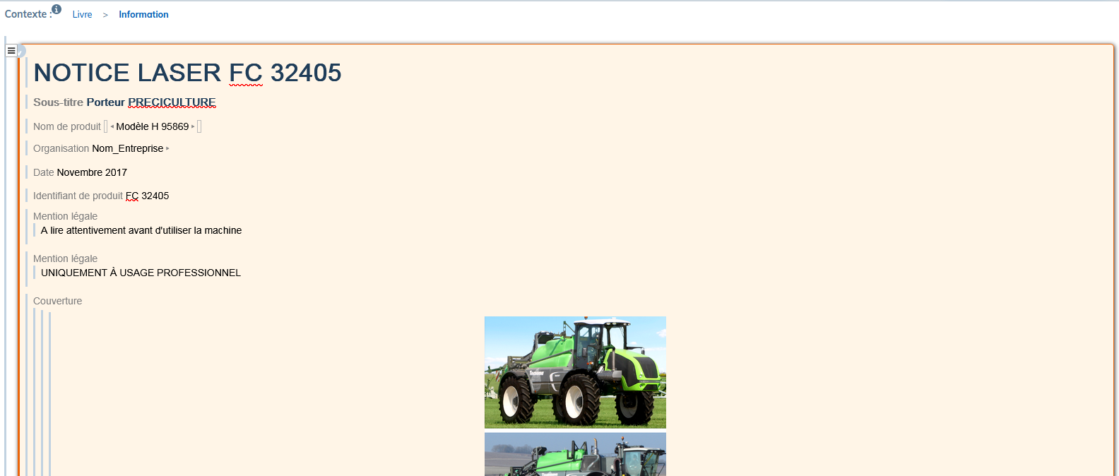
Place all the necessary images in the Information block > Cover.
Give each image a different value in the
roleattribute by selecting theimageobjectelement.Compose the xpath for each image as follows in the example: d:info//d:imageobject[@role='image_produit'].
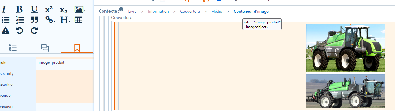
Table 1. Most Common Path Expressions
|
Syntax |
Use |
Example |
|---|---|---|
|
|
indicates that the element belongs to the DocBook namespace. |
d:info/d:date |
|
|
used to select children of an element. It indicates that we want to select an element that is directly under the parent element. |
d:info/d:date For the example given, the |
// |
used to search items in depth. |
d:info//d:date For the given example, we will search for all the |
|
|
selects all items. |
d:info/d:legalnotice/d:* |
|
|
used to filter selected items based on their attributes or values. Or to represent an index in a list. |
d:info/d:legalnotice[2] For the given example, the xpath selects the second |
|
|
selects attributes. |
d:info/d:date[@role='anniversaire'] For the given example, we select the |
3.2. Title pages
Three editing modes are available for a title page:
- Default: Front and back are published with standard style sheet templates.
- Customize recto: the layout of the title page for a document to be printed on one side.
- Customize recto - verso: the individual layout of the front and back of the title page.
It is possible to display on the title page the header and the footer configured in the menu Header and footer.
Click on to display options for setting the image and background color.
The settings panel contains a list of configurable widgets. Editing each widget follows the procedure described in Widgets.
The content of the title page is composed by dragging and dropping a widget. The configuration of the widgets placed on the title page includes:
- modification of its height and width;
- alignment between widgets with XY coordinates.
3.3. Page body
This menu is dedicated to the configuration of the elements that can be found next to the text in paragraphs.
3.3.1. Lists and procedure steps
These menus are used to manage the configuration of lists and procedure steps up to four levels.
Bulleted lists
The drop-down menu offers a choice of predefined bullets, no bullet, or a custom bullet.
To integrate a custom bullet:
Select “Custom” from the drop-down menu.
Paste the desired bullet symbol into the white square to the right of the menu.
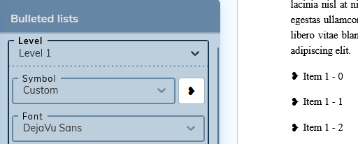
Make sure the custom symbol is supported by the set font.
3.3.2. Tables
This menu is used to configure:
- the color of the text as well as the background of a table;
- the style of outer borders and cell borders;
- the margins inside the cells.
3.3.3. Admonitions
This menu allows you to customize the admonitions icons.
The default icon preview depends on the content in your workspace that matches those items.
For spaces that contain the standard style sheet, the default preview is as follows:
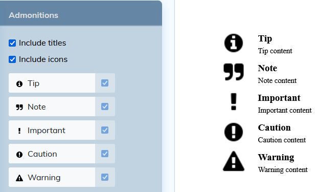
For spaces that contain the custom stylesheet for admonitions, etc., the preview will show the custom icons.
It is possible to modify the icons:
Click on admonition in the settings panel.
In the window that opens, select an image from the images present in your workspace.
Or import an image via the button at the top right of the window.
Uncheck the box to the right of each admonition to return to the default icon.
To modify a created style sheet, click on its label in the list of style sheets. It opens in the studio for editing.